PRODUCT DESIGN · CONCEPT · WEB
VEHICULUM WEBSITE
A concept-driven homepage redesign focused on aligning business values with user action through clearer hierarchy and stronger first-impression communication.
Vehiculum operates within a competitive leasing market where homepage space is often dominated by price-driven promotions. While effective in the short term, this approach gradually shifted attention away from the company’s core values of fair pricing, transparency, and service quality.
The challenge was to design a new first-page experience that communicates these values more clearly while still supporting the primary user goal of finding offers quickly. The homepage needed to balance branding, trust-building, and action, ensuring that the most important space on the site encourages engagement rather than passive reading.
This project approached the problem as a hypothesis-driven redesign, exploring how structure and interaction could better align business intent with user behavior.
Approach
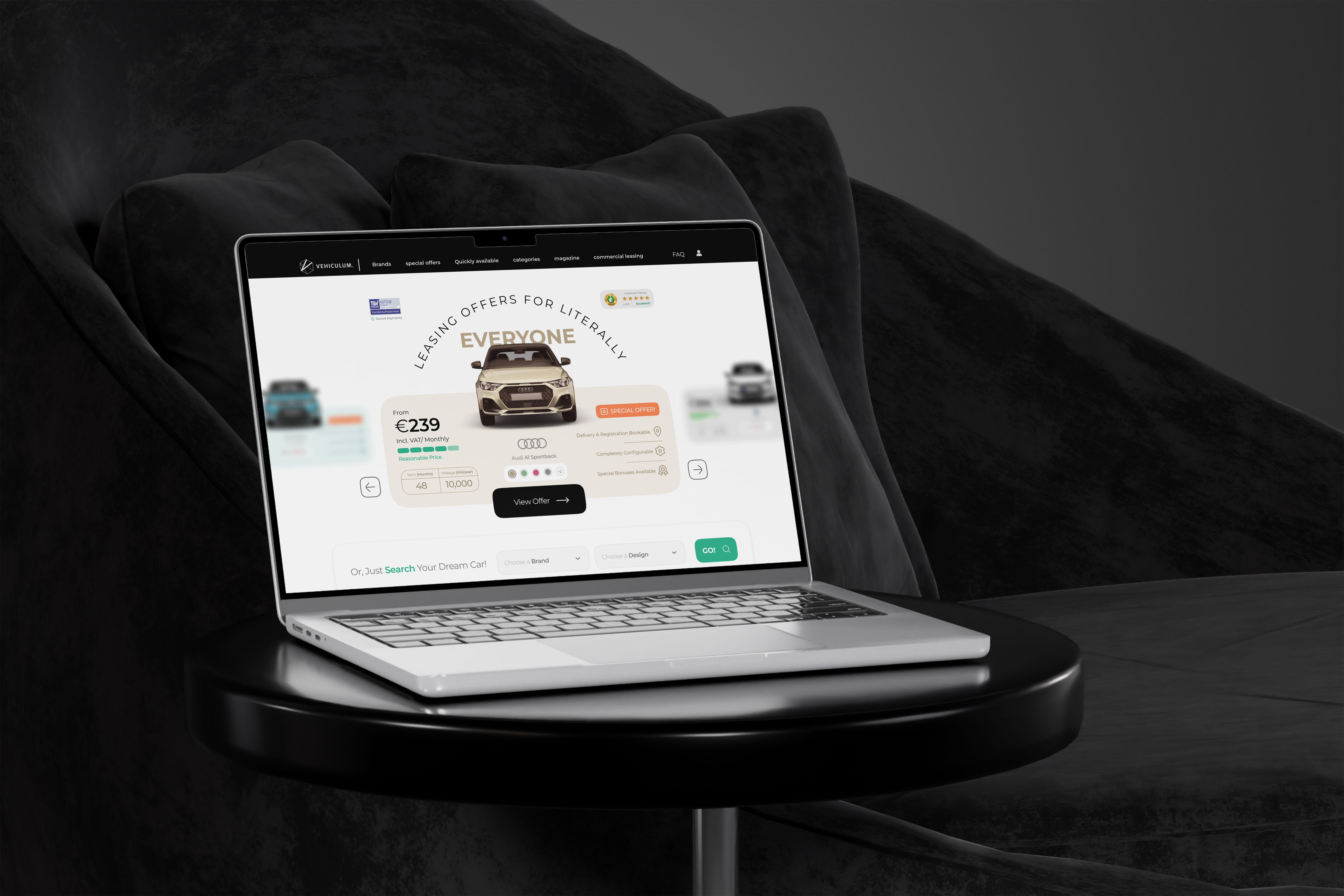
The goal was to rethink the header experience so that it supports both brand positioning and conversion without sacrificing usability.

The design focused on reframing the header as an actionable space rather than a static message. By integrating offers, search functionality, and value communication into a single structured layout, the experience guides users toward interaction while subtly reinforcing brand positioning through hierarchy and visual emphasis.

Outcome
The resulting concept introduces a more balanced homepage experience where commercial intent and brand communication coexist. Offers become entry points rather than distractions, allowing users to immediately engage while still understanding the company’s positioning.
The redesigned header improves visual hierarchy, creates clearer pathways to action, and establishes a stronger sense of trust through transparency-focused messaging. The concept demonstrates how small structural changes at the top of the page can influence both perception and usability across the entire experience.

Reflection
This project reinforced the importance of questioning initial ideas, even when they appear visually strong. Design solutions that only address surface-level problems often fail to support real user behavior.
By returning to user intent and business goals, the final direction became simpler and more effective. The outcome highlights how thoughtful prioritization and restraint can transform a homepage from a promotional surface into a functional entry point for decision-making.
